My Favorite Accessibility Plugins for Figma
Figma plugins are great tools for improving your mockups and prototypes. When designing for accessibility, they are really vital to helping us understand what users with certain disabilities experience and to ensure we meet the technical requirements for meeting accessibility standards like contrast ratio.
These are my favorite plugins when I’m designing and testing for accessibility in Figma.
Stark - Contrast & Accessibility Checker
With over 400,000 users, Stark is one of the most popular plugins in the Figma community because it is so comprehensive. It offers color blindness simulation, contrast checking, and can create a list of suggestions for accessibility improvements in your file along with many other features.
Text Resizer - Accessibility Checker
I use Text Resizer to show how a layout will change when a user increases their font size in the browser or has their default text size set higher than the default in their phone’s settings.
A11y - Focus Order
Microsoft Design has created a very useful plugin that helps ensure a logical focus order in designs. It simulates how users navigate through a design using a keyboard, allowing you to see and adjust the order in which interactive elements receive focus. Since almost all assistive technologies have a keyboard equivalent, allowing keyboard navigation is essential for accessibility.
Contrast
The Contrast plugin is a dedicated tool for checking the contrast between text and background elements to ensure they meet WCAG guidelines. It automatically identifies potential issues and provides suggestions for improvement.It’s even able to measure contrast when there are images or gradients behind the text.
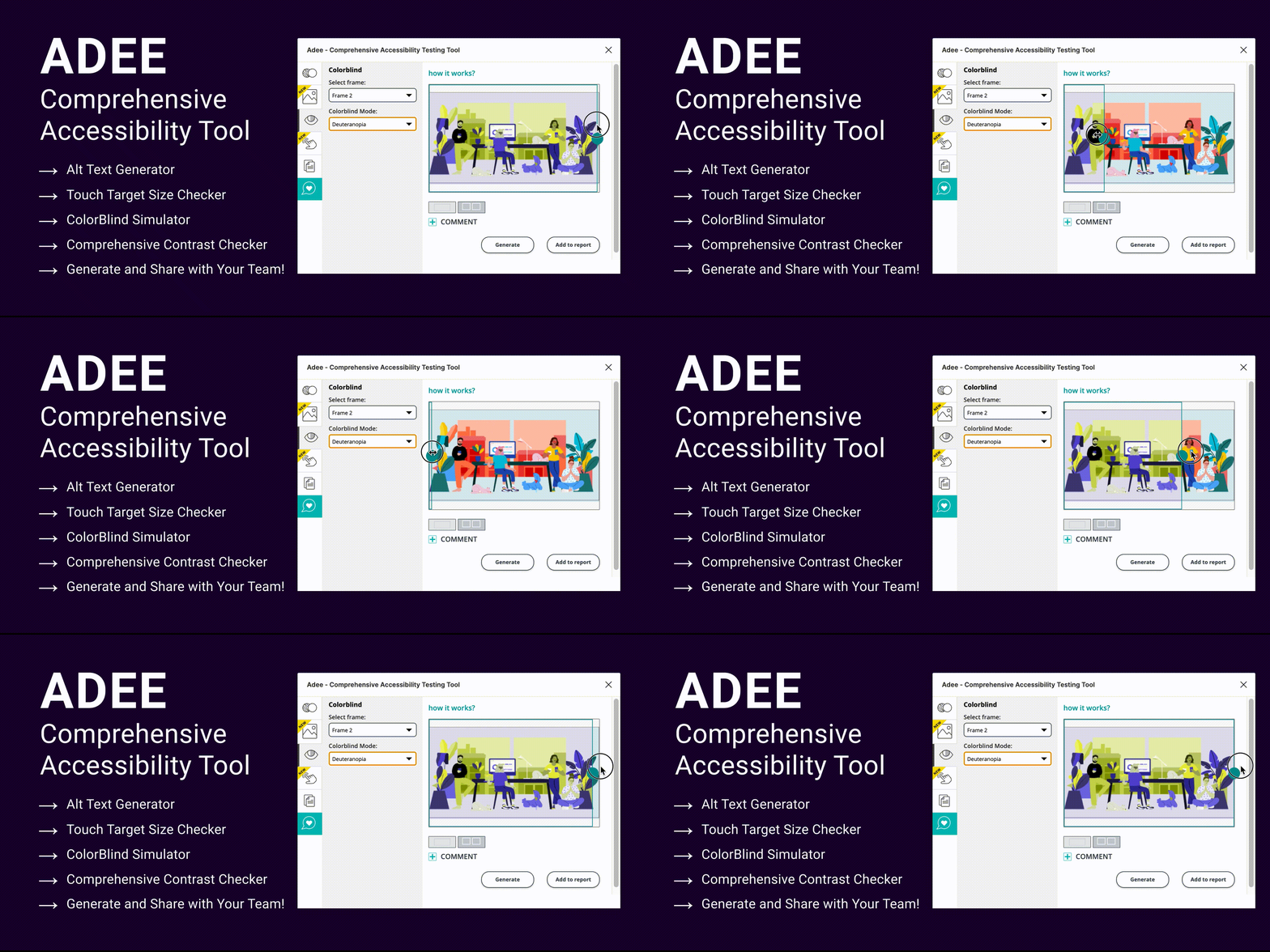
Adee Comprehensive Accessibility Tool
As the name says, Adee is a comprehensive plugin but what I really like it for is checking the target touch sizes in your designs. For users with mobility and fine motor control issues, because larger targets are easier to tap and reduce the likelihood of missed or incorrect inputs, enhancing overall usability and reducing frustration for your users.
There are more accessibility and inclusive design plugins that I use, for sure, but these are the ones I use most often and cover the wide range of accessible design standards that I follow.
What are your favorite accessibility plugins or tools that you use? Let me know in the comments!


